When I first started my business, I made a logo using my own handwriting—it was basically just a cleaned-up version of how I sign my artwork. Since then, I’ve used it on my website, business cards, greeting cards, and in select areas on the web.
From the beginning, I told myself I wouldn’t touch it for at least a year. I wanted to give it time, just to see how it held up and to focus on the more important parts of my business first. It’s now been about a year and a half, and I stuck to that rule! So when I finally found a bit of extra time this month, I was excited to revisit it with fresh eyes.
There were two main reasons I decided to make a change.
First, I didn’t realize early on how using my signature as a logo would start messing with how I sign my actual artwork. Over time, I noticed they began to feel a little too similar, but also not quite the same. That little inconsistency started to bug me. My real signature felt more like a fingerprint, imperfect and unique every time, and something I wanted to save just for my art.
Second was legibility. The first time someone asked how to pronounce my name based on the logo, I knew it was time to rethink things. For some businesses, that’s not a big deal. But since my name is my business, I wanted it to be crystal clear, no second-guessing.
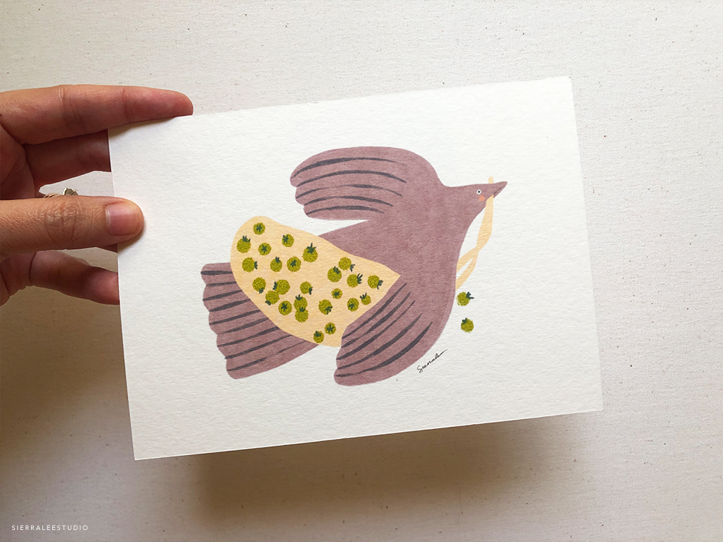
So today, I’m sharing my updated logo and the thinking behind it. I’m really excited about the direction it’s taken, and I hope you enjoy it as much as I do.
From Sketch to Final
With everything I’ve learned over the past year, I knew I wanted to keep the logo clean with a typed font—but still bring in some personality through illustration. My goal was to use what I’ve picked up along the way, listen to past feedback, and most importantly, just have fun with it. A logo shouldn’t feel too serious. It’s just one ingredient in the bigger recipe that makes up a brand.
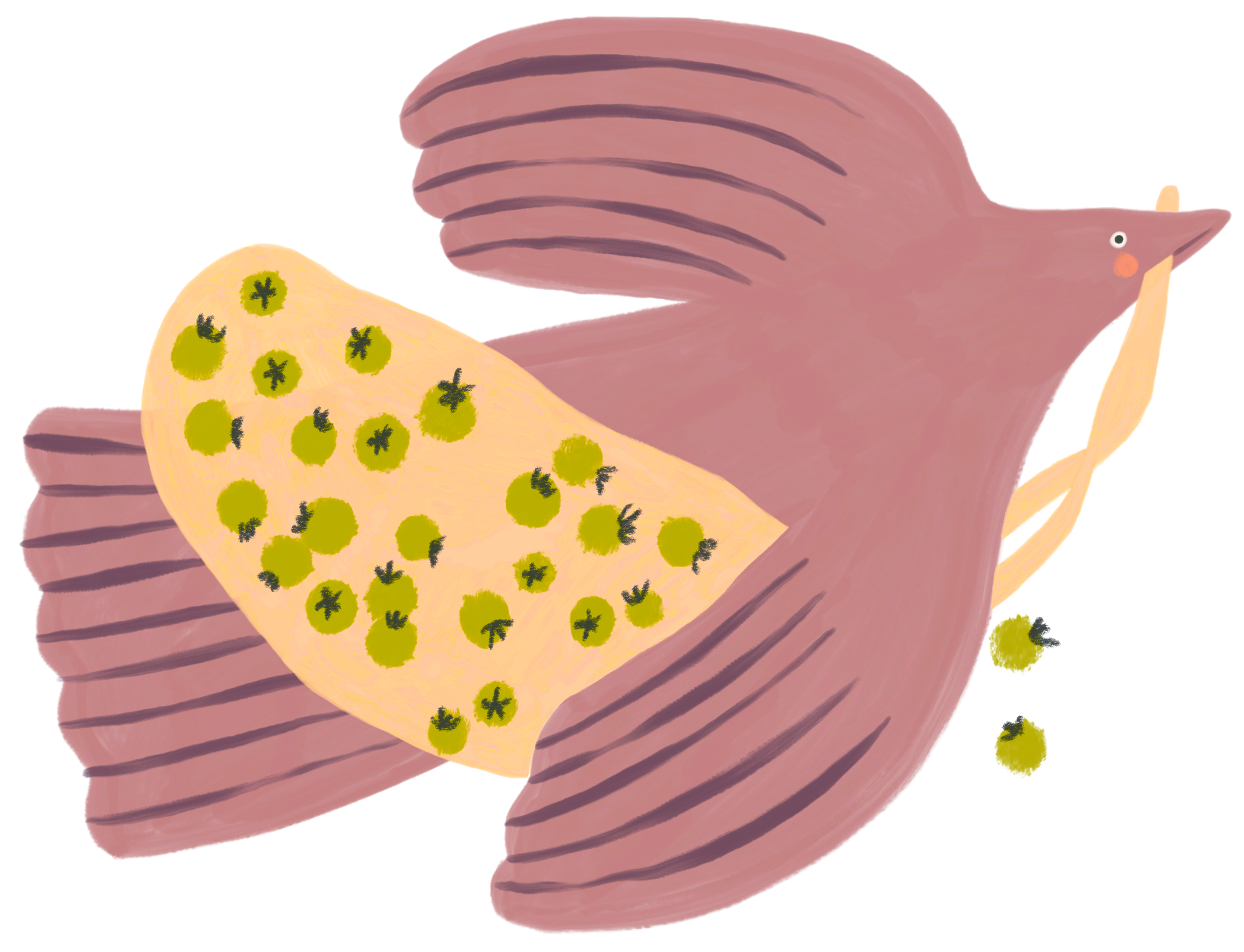
Like always, I started by sketching. I put together a small group of objects—things that either inspired me or felt connected to my story in some small way: a tree, tomatoes, a crab, a bird, an oyster, and sunshine. Each one had its own simple charm and felt like it could work as a little icon.
I decided to bring two ideas together—the bird and the tomatoes. The bird stands for creative freedom and looking ahead to all the possibilities of the future, while the tomatoes are a small, meaningful memory from my childhood (with my old nickname being Tomato). Letting the bird carry a little bag of tomatoes is my way of taking a piece of who I was with me, as I keep growing into who I’m becoming.
I also started paying attention to the words people often use to describe my work—charming, whimsical, illustrated, elevated—and made a list of my own too: clear, playful, professional, timeless, efficient, and handcrafted. It’s been helpful to see how all these pieces come together into something that feels more me.

I knew I found the sweet spot when my logo made me smile. The colors weren’t what I originally planned, but honestly, that kind of sums up how illustration has felt for me this past year—just experimenting, trying things out, and seeing what feels right as I go.
This imaginary bird is something I’ve doodled a lot in my free time, so it felt natural to let a version of it become part of the logo. In my home studio, I watch birds all the time outside my window, so it also feels like a natural connection to this next evolution of my mark.
Anyway, I’m really excited to start using it and to see how it shows up in the real world.
And if you’re also working on an illustrated logo or figuring out your own visual identity—just a gentle nudge that it’s okay to make it up as you go. Create from the heart. Don’t overthink it. You can always tweak things later—just have fun with it.
x, Sierra